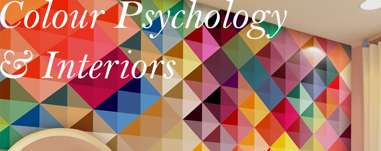
Colours are tools we use without speaking in order to affect one's mood or perception of something - and interor decor is no different!
Though the science behind it has been debated for many years, interior designers are firm believers that colour is so very important in aesthetics and how a room will make you feel. Below we've built a simple summary from many sources of information about what different colours communicate, and where you can use them in your home.
-
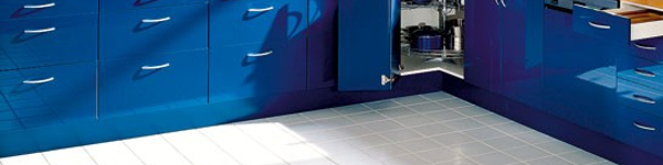
Blue
-
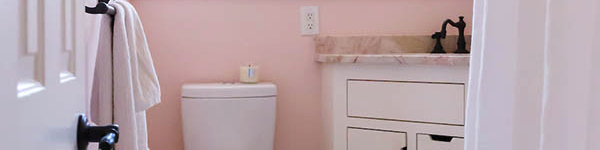
The colour blue in the home is often cited as 'the most productive colour', with calming and soothing tones. This is ideal for bedrooms, but also particularly useful for bathrooms (reminiscent of the sea!) and studies/work rooms, as it is said to promote intellectual thought. However, it is on the colder end of the spectrum, and can be uninviting when, say, exposed to little natural light.
-
With blue walls, a warm hardwood colour works delightfully well in order to balance out the cooler aspect of the shade. Warmer blues, such as a bold cerulean, can also be used with better effect.
-
Dark blues, on the other hand, can be used wonderfully to accent a room. Whilst it can be overpowering as a primary in the colour scheme, navy carpet such as Brinton's Bell Twist in Windemere Lake can provide the serious edge to an otherwise bright room.
-
-
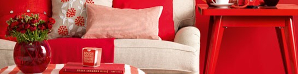
Red
-
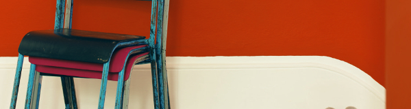
Associated with passion, energy, warmth and optimism, red is a perfect warm-spectrum colour to create a lively, sociable atmosphere.
-
Use red across living rooms and dining rooms/kitchens (this is a wonderful example) - particularly as it is said to encourage a healthy appetite! However, be careful not to overdo it; several sources report that red is a little hostile when used too much, and can possibly encourage headaches. It's often advised not to use red in a baby's room, and to vary the shades that you use.
-
When combined with a nice, soft fabric such as wool, red accessories like this Bokhara rug from Asiatic can add a comforting piece of the colour to a pre-decorated room.
-
-
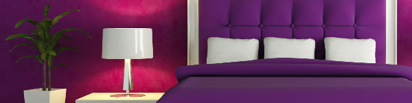
Purple/Lilac
-
In it's darkest shades, purple is rich, dramatic and sophisticated. When lighter, however, it can add a creative, joyous sanctuary free of stress, whilst retaining certain femininity. As above, this colour can be used wonderfully in bedrooms to evoke a decadent, luxury feeling with timeless appeal.
-
On the other hand, lighter purples can become insipid if used too frequently and darker purples can be a little depthless and heavy. To counteract this, it can be used only to accent - as here - or counteracted with metallics (such as silver) or even darker tones.
-
Historically, purple has been the colour of royalty; and you can see why when it is used in products like this John Sankey Byron chair, upholstered in velvet.
-
-
Pink
-
Some may say that pink isn't for everyone, but I would heartily disagree - associated with love, nuturing and happiness, pink is the more soothing cousin of red. Not just for a young girl's bedroom - but anyone's bedroom, if they have an ear for peaceful restfulness.
-
Remember, however, that too much pink is often sickly and many associate it with a youthful childishness. To counteract this, some suggest using charcoals or blacks in order to age the colour when it is the primary colour choice. Otherwise, if used as a brighter accent
-
Pink was one of the two colours of the year selected by Pantene in 2016, and is more of a staple than people think!
-
-
Orange
-
This is an energetic colour that balances between red and blue hues, often associated with providing security and stability. It evokes excitement and enthusiasm - so would be very useful in decorating an exercise room!
-
Orange may be a little strong for a bedroom, a living room and dining room would also benefit from a splash. However, as it is a rather advancing colour, it can make a room look smaller - so make sure said room gets plenty of light throughout the day.
-
Whilst not a straight matte orange in nature, warm-coloured wooden furniture that is well made can add the accent of orange you are looking for. For example, this Traditional Three-Drawer Chest in antique bleached cherrywood works perfectly.
-
-
Yellow
-
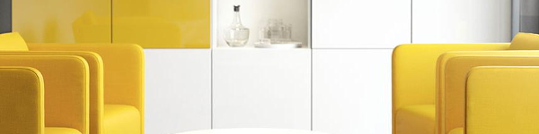
The brightest and happiest of the colours! If you're looking for an injection of uplifting energy with a dash of sunshine, you'll find it in yellow.
-
Kitchens, dining rooms and bathrooms will all benefit hugely from a splash of yellow. In smaller halls and entrance ways, yellow can also feel more expansive and make a room seem larger. However, be warned - a bold, pure yellow might be a little much for a primary colour choice! Apparently, studies have shown that people are more likely to lose their tempers in a yellow interior.
-
A perfect example of how to use yellow wisely can be seen with our Duresta Juliette Chaise Longue, where yellow has provided an eye-catching detail in the form of a cushion.
-
-
Green
-
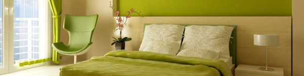
Apparently the least straining colour for the human eye, green works wonders by being refreshing, natural and cheerful.
-
Working best in bedrooms (in all variety of shades), living rooms, and bathrooms when used in fruity brights or subtler pastel versions. Supposedly, too much green will eminate the appearance of being too laid-back; to which many recommend injecting bold colours such as orange or red.
-
Accent green rooms with a neutral wool carpet colour - say, a light Rustic Weave - for that truly natural aesthetic.
-
-
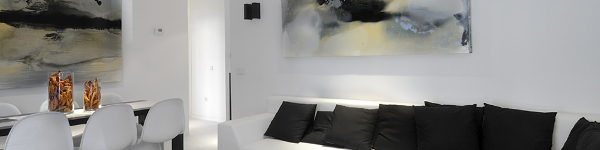
Neutrals
-
Colours such as black, white, grey and brown and essential to a designer's toolkit. Not only can they (generally) be used to accent any other colour chosen as a primary, but they make stunning primary choices of their own.
-
Black works well used in smal doses, so as to not be overwhelming but to add grounding.
-
White is the classic neutral, with which a blank, elegant canvas exists to add style. Can be a little boring, however!
-
Brown adds stability and practicality to a colour scheme - particularly when used through wooden furnishings and carpets.
-